 |
| Image Credit: Uber.com |
"Hi Guys, I'll see you in a bit, I am just grabbing an Uber."
"I'm too drunk to drive, I'll grab an Uber."
"I don't own a car, it's cheaper for me to Uber."
Visual and Verbal Language is the way a brand is seen, read and heard.
We will look at the Visual and Verbal Language of Uber and why it is successful.
We have all heard the phrases in the opening paragraph regularly since the inception of Uber in 2009.
It has effectively replaced the way we look at and deal with public transportation in over 60 countries and 400 cities.
So in the theme of this blog the reason why I chose Uber is because the word, Uber, has effectively replaced the word "Taxi", it is now a Generic Term. The word Uber is now used as a verb and a noun.
Uber is a great example for this area of Visual and Verbal Language as we have an Old and New Brand Identity to compare.
Umm wait, what?
Cambridge Dictionary defines Peer to Peer as:
Peer to peer is "used to describe computers that work together to form one system."
This means my phone talks to your phone and we can meet to swap goods or services. In this case, we share a car ride from A to B for remuneration.
Got It! Great!
So lets delve into this a bit further.
As suggested by Klopper
and North(2011:18) there are 3 properties that can help us understand Verbal
and Visual Language:
- Brand Tone of Voice
- Brand Symbols
- Brand Story
Lets start with Ubers Brand Symbols:
Uber has reinvented its image to replace the 2016 Logo, Name and App Icon into a singular, consistent, recognizable Identity.
Uber now uses the wordmark as a logo, no need for a symbol icon, this unifies the look and language of the brand name across all platforms making it easy to recognize anywhere! Across all media, on vehicles and Uber Ranks ( Not Taxi Ranks) at Airports.
The simple black background and white font are eye-catching against a world of competitors who are using bright colors in their logos.


Easy to read, easy on the eyes and consistency Is the name of the game for the Visual Language of Uber!
As Uber is a worldwide business, the typography and ease of recognition has to be universal so all stakeholders understand and recognize the brand.
Ubers new drive is to reinforce its commitment to safety, for both the driver and rider, and the smooth font type and low case lettering are used to put the stakeholders as ease as well as provide an iconic sense of confidence in the brand.
Ubers brand tone is simple and polite. Short and to the Point.
This works well as Uber is an app based business that has to get its message across on a small platform.
Simple phrases like:
"Where to?"
"Set Pickup Location"
"Finding your Ride"
This tone my be short and to the point, but it is also informative and polite.
So what about the Uber story? Where does this fit in?
Well I see Ubers story as a tale of 2 tales.
The History and The Interesting Fact:
The quintessential entrepreneurial story began in December of 2008
"On a snowy evening in Paris, Travis Kalanick and Garrett Camp can't get a cab—the idea for Uber is born."
In 2009 the app goes live and bingo bango we have Uber!
The Interesting Fact
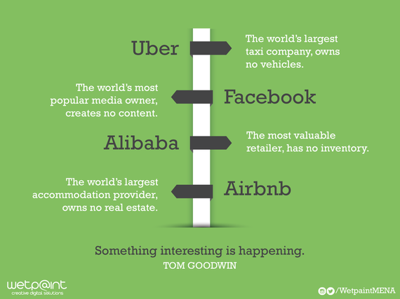
Uber is one of only a handful of companies that owns no assets.
Its a "Taxi" Company that doesn't own any "Taxi's"
This puts Uber in such illustrious company as Facebook, Alibaba and Airbnb.
Although these are both very short stories, they have inspired others to copy them, and as we know copying someone can be regarded as the highest form of flattery.
Therefore in closing we see that Uber's Visual and Verbal Language is:
Simple -In a world were technology can be daunting.
Universal - Consistent message across the globe.
Effective - Relate-able to all stakeholders
This is what makes Uber so succesful.
Therefore in closing we see that Uber's Visual and Verbal Language is:
Simple -In a world were technology can be daunting.
Universal - Consistent message across the globe.
Effective - Relate-able to all stakeholders
This is what makes Uber so succesful.

Comments
Post a Comment